NationSwell
NationSwell
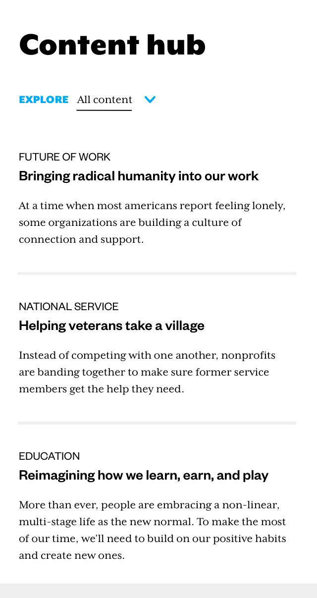
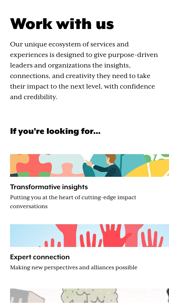
NationSwell, a social impact company that partners with purpose-driven leaders and organizations, was in need of an online presence that better represented NationSwell and its extensive ecosystem to assist those looking to create social change. As the first full-time design employee at NationSwell, I led the creation of an updated site concept to better serve NationSwell, in collaboration with our Managing Director and Partnerships Manager.
Through design research, stakeholder meetings, and feedback from partners and NationSwell Council members, this updated site concept more holistically encapsulates NationSwell's expertise, capabilities, and theory of change for prospective partners and Council members.
NationSwell is a social impact company that partners with purpose-driven leaders and organizations to take their impact to the next level. With an extensive ecosystem to assist individuals and organizations looking to create social change, their online presence wasn't representative of NationSwell or its capabilities. Through my leadership, design thinking, and collaboration with our Managing Director and Partnerships Manager, I created an updated site concept to better serve NationSwell.
Through design research, stakeholder meetings, and feedback from partners and NationSwell Council members, this updated site concept more holistically encapsulates NationSwell's expertise, capabilities, and theory of change for prospective partners and Council members.
Work completed at NationSwell.

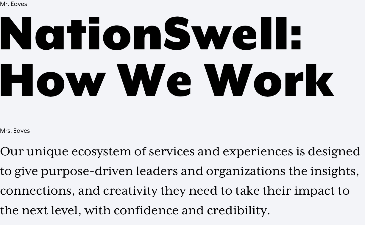


The updated design reflected and was a companion to a new brand positioning for NationSwell that was created in January 2020. Upon completion of the positioning, I codified five design principles to visually demonstrate the qualities NationSwell's leadership expressed: confident, credible, inspiring, empowering, and personal.
The updated type and color palette are an evolution, and more refined and versatile approach to the previous visual language that was used in brand materials. Mr. Eaves and Mrs. Eaves, two font families that take a modern approach to familiar type styles, lent themselves to NationSwell's refresh and look towards the future.
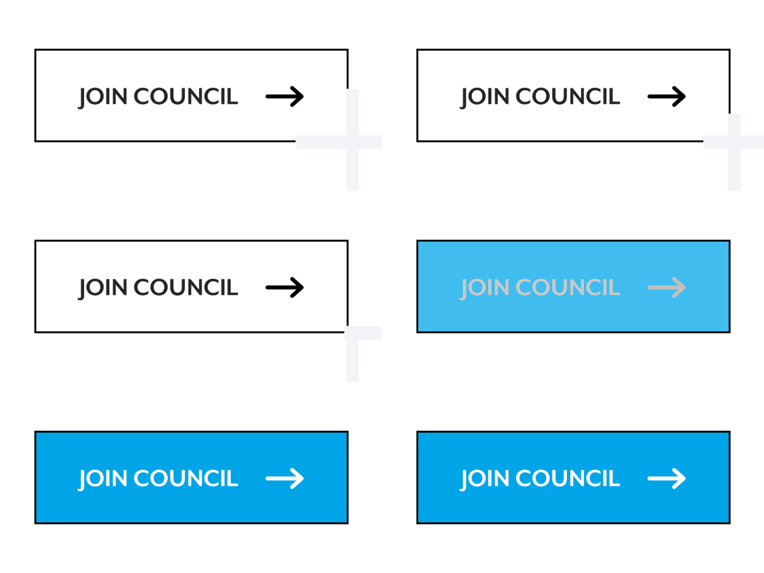
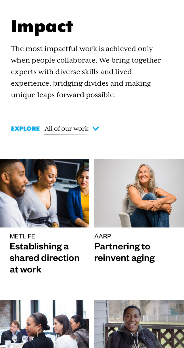
Introducing interactivity and motion brought a humanism and sense of inclusivity to NationSwell's message, while elevating and refining the design with an attention to detail.
The updated design was a reflection and companion to a new positioning for NationSwell that was created in January 2020. Upon completion of the positioning, I codified five principles to visually demonstrate the qualities NationSwell's leadership expressed: confident, credible, inspiring, empowering, and personal.
The updated type and color palette are an evolution, and more refined and versatile approach to the previous visual language that was used in brand materials. Introducing Mr. Eaves and Mrs. Eaves, two font families that take a modern approach to familiar styles, lent themselves to NationSwell's refresh and look towards the future.
Introducing interactivity and motion brought a humanism and inclusivity to NationSwell's message, while elevating and refining the design with an attention to detail.



Browse More Projects

Yahoo Small BusinessElevating a brand that helps small business owners succeed.

ZillowHelping people make home a reality.

RecycleSmartMaking everyday recycling easier.

Cooking to HireWhat if hiring better coworkers started in the kitchen?

MetLifeFinding a sense of purpose and shared direction at work.
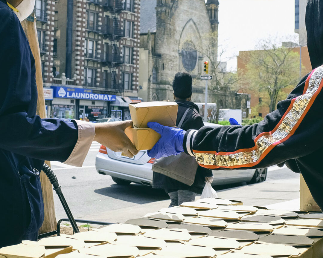
Rethink FoodAnalysis of a disruptive business model that's creating systemic change in our food systems.
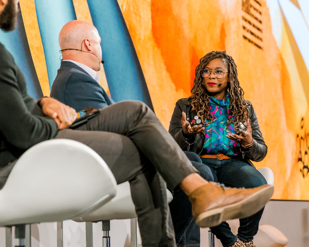
NationSwell SummitBranding a day about "caring for each other."

KneeFixA health and wellness app assisting in knee pain and injury recovery.

MIGA corporate site supporting human development.

ClipperA campaign to connect transit riders across the Bay Area.